Design for all
Digital design for all aims to offer digital products and services in such a way as to be used as easily as possible by everyone. Achieving this requires people in distinct roles to work together. Here we are going to focus on one part: designing web-based graphical user interfaces that are accessible to everyone.
When starting a new project, designers usually ask who they are designing for. Today, our answer will be: “Everyone”. Accessibility starts with designers putting themselves in other people’s shoes: How can a woman use my website when she is being blinded by the sun? How can a man without arms navigate my app? How can a person who barely speaks German fill out my form? This does not just affect people with disabilities – we all find ourselves at some point in situations where barriers prevent us from easily using a digital product.
Legal foundations
What should we use as a guide if we want our next project on the web to be accessible? The German Accessibility Reinforcement Act1 will apply from 2025. It stipulates that websites and other digital products and services created from 28 June 2025 onwards must meet accessibility criteria and provide corresponding documentation.
WCAG
However, the criteria in this law are very general. The Web Content Accessibility Guidelines2 are much more specific and of interest to designers as it is here that success criteria for accessibility are defined. A distinction is made between four principles:
- Perceivable: Are all elements recognizable and distinguishable? If not, are there any other alternatives?
- Operable: Can elements be operated in diverse ways, for example using the keyboard instead of the mouse?
- Understandable: Is the content readable and predictable, is there support for errors?
- Robust: How compatible are elements with assistive technologies, such as screen readers?
What constitutes accessible design?
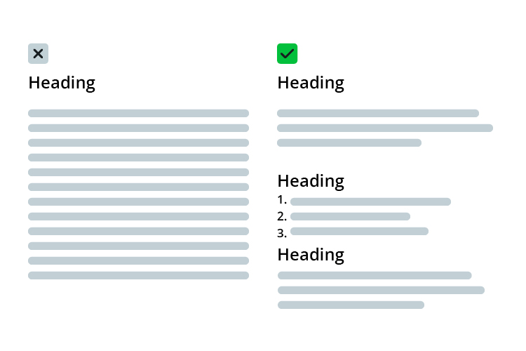
A clear hierarchy is the be-all and end-all. Subheadings, bullet points and numbered lists allow users to grasp and understand content more quickly and easily. The maximum line length should be around 70 characters. If headings are indicated by <h> tags, users can easily navigate through the web interface using screen readers. It is important to label elements using the correct HTML tags to make them recognizable to assistive technologies.
Colours
Colours play a key role in every design. In addition to visual stimuli, they also provide structure and orientation. However, you should not rely on colours alone. Around 8 % of people in Germany are colour-blind. Therefore, another distinguishing feature should always be used, such as typography, icons, or the arrangement of elements.
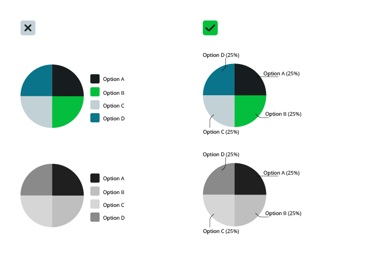
Colours should always have sufficiently high contrasts to ensure legibility, especially font colours. Furthermore, these should not be placed in front of images, but in front of high-contrast surfaces. To assist in this there are contrast calculators available for tools such as Figma, InDesign, or common internet browsers.
Text and fonts
We distinguish between four types of text:
- Reading text is the usual scrolling text. This should be easy to read.
- Consultation text supplements the reading text, for example in marginalia or footnotes.
- Signalling text is important for orientation, for example on signs or guidance systems.
- Display texts are headings, for example. They are used for organization and structuring.
Further questions arise depending on the application and type of text:
1. Which font?
Like any good designer, I have more fonts installed than I will ever use. However, some fonts are more legible than others. Especially in reading and signalling text, legibility is a priority for font choice.
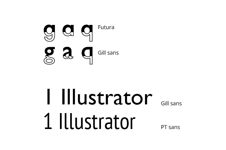
But what does legibility mean? The answers can be found in DIN standards 1450 and 1451, summarized briefly: Letters should be easily recognizable and easily distinguishable from one another (Sorry Futura!)3.
2. What font size, what line spacing?
The font size depends on text type, font and reading distance. The German Association for the Blind and Visually Impaired offers a font size calculator4. Line spacing should be at least 120% of the font size, so for example if I have a font in 10pt, You should choose at least 12pt line spacing. Often 13-14pt is better.
3. Which arrangement and which layout?
Text should be left-aligned in Europe. Left-justified paragraphs are also recommended as, unlike centrally justified text, it has no irregular spacing between words and fewer word divisions.
4. And what about highlighting?
We can emphasize titles easily using the font size. Within texts use bold rather than underlining to provide emphasis as on graphical user interfaces on the web, underlining is usually used to indicate a link. Colour is also a means, but preferably, use bold copy. When reading, we also scan the heights of letters. Sentences in all capital letters offer the eye less orientation and are more difficult to read.
Images, videos, and icons
A few more simple tips on how to make images, videos, and iconographic representations more recognizable for everyone:
- Always add alt text to images. This is not only read by screen readers, but also by Google, and is therefore SEO-relevant.
- Always create controllable videos. This means that they do not start automatically, and users have the option of controlling the volume and pauses. Subtitles should be provided if necessary.
- Icons are not self-explanatory! Even if we know that three horizontal lines symbolize a navigation menu, not everyone has this same knowledge. People are not born with a general understanding of icons and symbols, it is learned – or not. Symbols should therefore be embedded in an explanatory structure, for example using labels.
Input and dealing with errors
Forms and other input options are often critical to the success of digital products or services. They should therefore be as simple and intuitive as possible. It is useful to add short explanations and labels. In principle, as little data as necessary should be requested.
No matter how intuitive forms are, users make mistakes. When dealing with errors we can work with text, colours and icons. In the end, it should be clear to the user where exactly the error occurred and how they can correct it.
Further topics
In this article we have focused on the visual success criteria of digital accessibility. It is not only designers upon whom the success of a project depends, but also upon developers, copywriters, and project managers.
After all, there are other factors that play a role in addition to design:
- Simple and easy language
- The technical requirements for assistive technologies, such as ARIA labels
- User testing, technical testing, regular evaluation
Designers can play a key role in passing on their knowledge and sensitizing their teams, because “Design for all” requires the help of everyone involved.
-
The German Accessibility Reinforcement Act and the associated directive. ↩
-
Website of the German Association for the Blind and Visually Impaired leserlich. ↩