Rarely has our apartment looked as good as it did during the lockdown period of 2021. For the first time in years, we had the time and no excuse to deal with the deferred projects in our own four walls. The basement and the closet were cleaned out in the finest Marie-Kondō-manner and small DIY projects to improve the apartment were more or less successfully implemented.
Next up was the fridge. The freezer compartment had to be de-iced again and the vegetable drawer needed to be cleaned. So we cleared the refrigerator out, scraped the ice out and cleaned everything thoroughly. After we adjusted the temperature control we could check off another project on our list. “Nice!” we thought, until we were caught by surprise a few hours later.
“…#@$!, I hope you like frozen yogurt? That fridge is freezing! …”
The contents of the refrigerator were frozen. How could this happen? The cooling capacity was set to the lowest level, wasn’t it? Was our refrigerator broken? A longer research on the internet brought us on the right track: Apparently we were the problem!
As it turned out, we were to blame for the frozen yogurt, as we had unintentionally set the temperature of the fridge to 1 °C. Pretty stupid!
How did this accident happen?

Unlike most refrigerators we’ve seen, this one didn’t have a dial to adjust the cooling capacity from low to high, but instead had a digital temperature control that set a specific operating temperature. Upon closer inspection, there is even an inconspicuous “°C” icon on the far right of the paneling. So we had set the temperature to 1 °C instead of the lowest level “1”.
So did the fault really lie with us, the users?
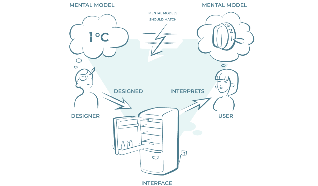
The question can be answered with a clear “no”. While we were the culprits who froze the yogurt cultures, it was the job of the fridge’s interface designers to ensure that the interaction was understandable and intuitive. In general, UI designers need to make sure that their idea of how the interface should be used matches the user’s expectation. If these two ideas – or mental models – of the interaction do not match, poor usability is inevitable.
How mental models can help us achieve better usability.

The term “mental model” was coined by Donald Norman as early as 1988 in his book “The Design of Everyday Things”. Even before the actual interaction, we have a certain idea of how an interface works or will behave. This idea is shaped by our personal experience, cultural influences and general conventions. We form a mental model of how a system will behave during interaction. This model is based on an expectation and not on facts.
In the frozen yogurt case, we had formed a mental model based on years of experience as refrigerator users that a small number would correspond to a low level of cooling. The mental model of the designers was that the number corresponds to the actual temperature.
By looking at the two models, a potential mismatch can be quickly identified, which can be remedied in user-centered design in two ways. Either the interface is adapted to the user’s mental model, or the user is encouraged by good design to form the mental model appropriate for the interaction. It is the designer’s task to make this possible by translating the model into the interface in a comprehensible way.
How could this “accident” have been avoided?
A user test could have provided information on whether the chosen solution for regulating the cooling capacity works and whether the mental models of the designers and users match.
Good design can be achieved through the use of the design principles. In this case, placing the temperature unit “°C” immediately next to the digital display would have created an immediate relationship between the number and the temperature unit through the law of proximity. A larger font size and a stronger contrasting color for the temperature unit would improve readability. The mental model of the user could be influenced by these changes in such a way that the mental models match and a misinterpretation of the display is avoided.
What does this UX-ident show us?
Due to the accident with the frozen yogurt, the refrigerator manufacturer has suffered a small damage to its image, which will be remembered even after the actual use of the interface and possibly influence the decision for the next refrigerator purchase.
In addition to instructions on how to make frozen yogurt, this case shows that checking the mental models of users and designers in the design process of a user interface is essential to ensure good usability. This in turn is a basic requirement for a positive user experience.

